(this is a continuation from Part 3)
The leaflet library
As mentioned in Part 3, the leaflet libraries is developed by RStudio (a guarantee of quality!) and it is based on the best JavaScript mapping library: leaflet.js by Vladimir Agafonkin. It is Leaflet is an open-source JavaScript library for mobile-friendly interactive maps: only 33 KB of JS!
The R library leaflet is undergoing a major revamp as we speak. in order to get (some of) the latest features, I’ve used the following code to install it in my laptop:
devtools::install_github("rstudio/leaflet", ref="feature/color-legend")
I expect that the “feature/color-legend” branch will be merged in master in a matter of days and specify a branch will no longer be necessary.
This is the “core” code used to render the map (inspired by the work of Yihui Xie and Joe Cheng at RStudio).
#------------------------------------------------------------------
# As we may want to play with different colours palettes or binning types, variables etc.,
# a function may be useful

myMap = function(shape,szoom, pal, area,vals,Pops, ...) {
  mbox <- bbox(shape)
  cLong <- round((mbox["x","min"]+mbox["x","max"])/2,4)
  cLat <- round((mbox["y","min"]+mbox["y","max"])/2,4)
  #
  leaflet(data = shape)  %>% setView(cLong, cLat, szoom) %>% addTiles() %>%
    addPolygons(fillColor = pal(vals),
                weight = 2,
                opacity = 1,
                color = 'white',
                dashArray = '3',
                fillOpacity = .5,
                popup = sprintf("<strong>%s</strong><br/>%g%%  of %g", area, vals,Pops)
    ) %>%
    addLegend(pal = pal, values = vals, ...)
}
A few comments:
- The “leaflet” function call components are piped using the great magrittr package.
- “leaflet” will by default use openstreetmap (this is the addTiles() portion). Other types of maps, usually open source, can be used. See here.
- It is useful to centre the map. The easiest way to do it is to get the “box” of the overall shape, which are the minimum and maximum long / lat coordinates of the geojson shapes we are using, and calculate the centre.
- We discussed popups in Part 3. Here I show an implementation with sprintf. It can be made more complex and display data on multiple lines (and it could as well become a character specified as function parameter).
Binning & Colour Palettes
As discussed we build a choropleth to display numerical variables, either continuous or discrete.
As we want to colour the different areas in relationship to a chosen variable, we need to find a way to bin the data in the number of cuts we want to use for the map.
On the other hand the number of cuts (or bins) depends from the available number of colours in the colour palette we have chosen.
A good start is to choose the colour palette (but it is a chicken and egg argument).
The absolute reference here is Cynthia Brewer and her amazing work at PennState. I strongly recommend to spend time at the site she created, trying the different palettes and understanding the nature of data we need to display (sequential, divergent or qualitative) and whether we need to cater for colour blind people.
Cynthia has also inspired the creation of the R package RColorBrewer.
The colour palette I have chosen is ‘YlOrRd’. Again I recommend to go onto Cynthia’s website and experiment with different palettes.
Please consider that the maximum number of colours for sequential data is 9, so we will have to use 9 bins or less.
“leaflet” offers the following binning functions:
- colorNumeric is a is a simple linear mapping from continuous numeric data
#’ to an interpolated palette. - colorBin “maps continuous numeric data performing binning based on value through the base::cut() function”, according to the help in the leaflet package. In reality under the hood the binning is done with the function base::pretty(). The result is that currently the specified number of bins are taken only as an indication.
- colorQuantile is similar to colorBin but uses the base::quantile() function. From R help: “The generic function quantile() produces sample quantiles corresponding to the given probabilities. The smallest observation corresponds to a probability of 0 and the largest to a probability of 1.”
- colorFactor maps factors to colours. If the palette is discrete and has a different number of colours than the number of factors, interpolation is used.
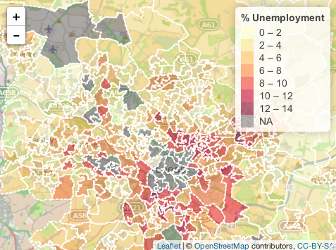
I have decided to display unemployment percentage figures in Leeds LSOAs, so the function colorBin is the most appropriate. I will specify 5 bins, but pretty() in my case decides to use 8 bins.
# Please note that bins = 5 is actually superseeded by the use of pretty()

pal = colorBin('YlOrRd', leedsShape@data$Unemployed_, bins = 5)

myMap(leedsShape, szoom=11,pal,vals= leedsShape@data$Unemployed_,area= leedsShape@data$Name,
         Pops= leedsShape@data$Workers, title = '% Unemployment')
I published the entire code of this part here, where you can also navigate the map (zoom etc.).
Below is a static pic of the resulting choropleth:
In the next part we will visit some of the other binning
functions.
This concludes Part 4 of the tutorial.